Tips to Help You Create Incredible AI Art with AI Art Studio
AI Art is fun, but sometimes it can be tricky to get the result you're looking for. Here are several tips you can experiment with to make your images come out the way you want them to.
Sometimes, the images produced by AI Art can be monstrous. Here’s an example of what I mean:
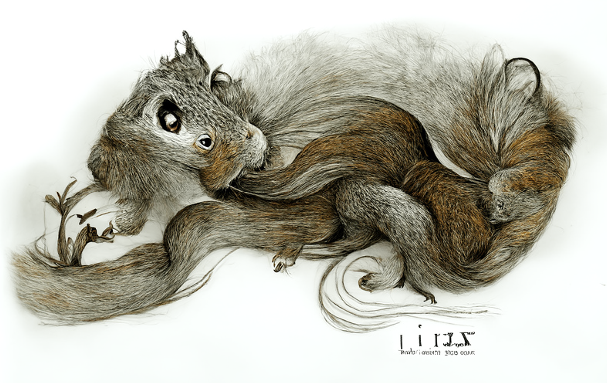
The text prompt for this was “a beautiful illustration of a squirrel by Lizbeth Zwerger.” Now, I find this image kind of fascinating. It has some nice flowing curves, beautiful detail on the fur, even an attempt at a signature (I think I see an L, I and Z in there). If that’s what you want, more power to you. Good art is often disturbing. But if you want a beautiful illustration of a squirrel, this isn’t it. So why did the model produce this?
Once you understand how the model works, it’s not hard to see what has gone wrong.
The model starts with an image that is just randomness. It looks at a small square of that image— it might be 256 x 256, or 512 x 512 pixels — and tries to change it a little bit it to look a little more like the text prompt. This happens thousands of times, gradually making each patch it looks at closer and closer to a match to the text prompt. But since it doesn’t plan out the overall layout, you end up with something like this, that looks like the parts of a squirrel all jumbled together. That’s why it can’t quite get perspective right. That’s why the horizon line is often broken. That’s a big part of why it always messes up faces. It’s only working on a bit at a time, and doesn’t have an overall layout for the image.
Some Solutions
There are a few tricks you can use to produce better images.
1. Limit your subject matter
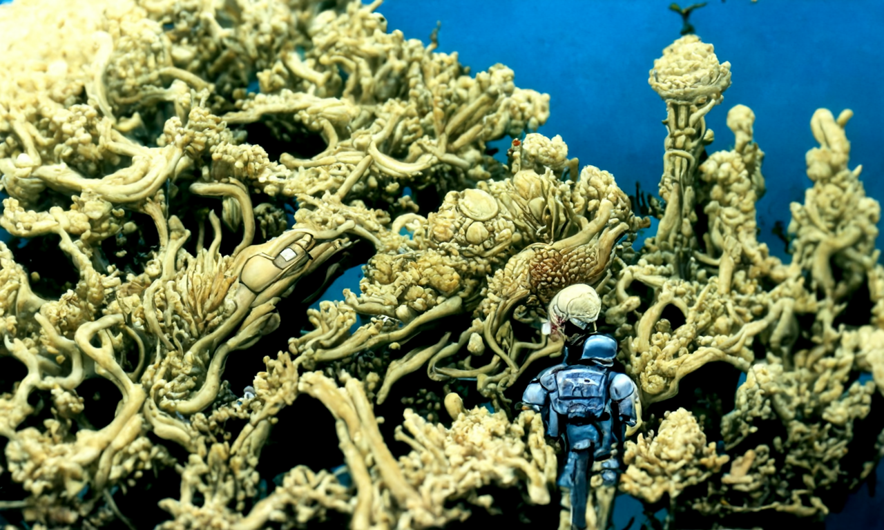
A few kinds of objects in the world don’t have much large-scale structure. As long as each part looks like it’s made of stone, a mountain chain can have pretty much any shape. A mossy patch on the ground, a town that has grown up gradually over time, a cloud, a coral reef, are all recognizable, but random in form. As long as the details look right, the overall shape is not particularly important. So if you stick to these subjects when creating AI art, the results will look more natural.
2. Limit your scale
If you keep to images smaller than 512 x 512, the model is able to consider the entire image at once while making adjustments. It doesn’t entirely eliminate these kinds of issues, but it does tend to reduce them. I find that if I generate a much larger image, I might get multiple suns, or multiple horizon lines, and that this usually won’t happen with a small square image.
3. Crop the output
You may find it more practical to just let the mistakes happen, and then choose part of the image that you like and throw away the rest. Remember that beautiful imagery is no longer a scarce resource. You don’t have to save all of it.
4. Use an initial image
The most powerful technique, though, is to impose an overall structure on the image, and just use the model to fill in the details. Human artists work this way all the time. They first create a thumbnail sketch that lays out the blocks of color. Once they have a thumbnail they like, they scale it up and add all the details.
In our program, the initial image needs a URL. So if you create a thumbnail sketch by hand, you’ll have to upload it to the web. I often use Imgur for this— you upload an image from your computer to the Imgur website, right click on the image and say “copy image address”, and use that as your initial image URL. Another option is to do an image search for your term and choose an image that has the overall layout of colors that you want.
I wanted to render “a beautiful painting of a dining room in an ancient castle by James Gurney.” When I used that prompt, here is what it generated:
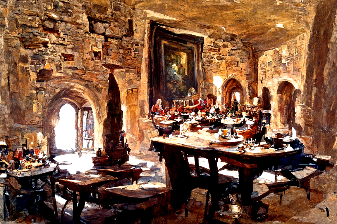
There’s some interesting things going on, but there is no consistent floor or roof, and the perspective is all over the place. I could crop the image:
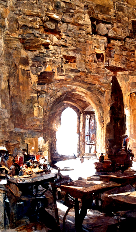
This looks physically consistent, but there’s not much sense of being in a dining hall. Instead, let’s see what we can do with an initial image. I used Google Images and tried a few different searches until I saw a thumbnail I liked. This is the image I found:
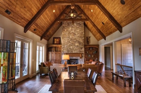
I like the layout and the overall color scheme, but of course I want it to look like a medieval hall, not a modern home.
For all these examples I’m going to use 250 steps. Here is what the input parameters look like:
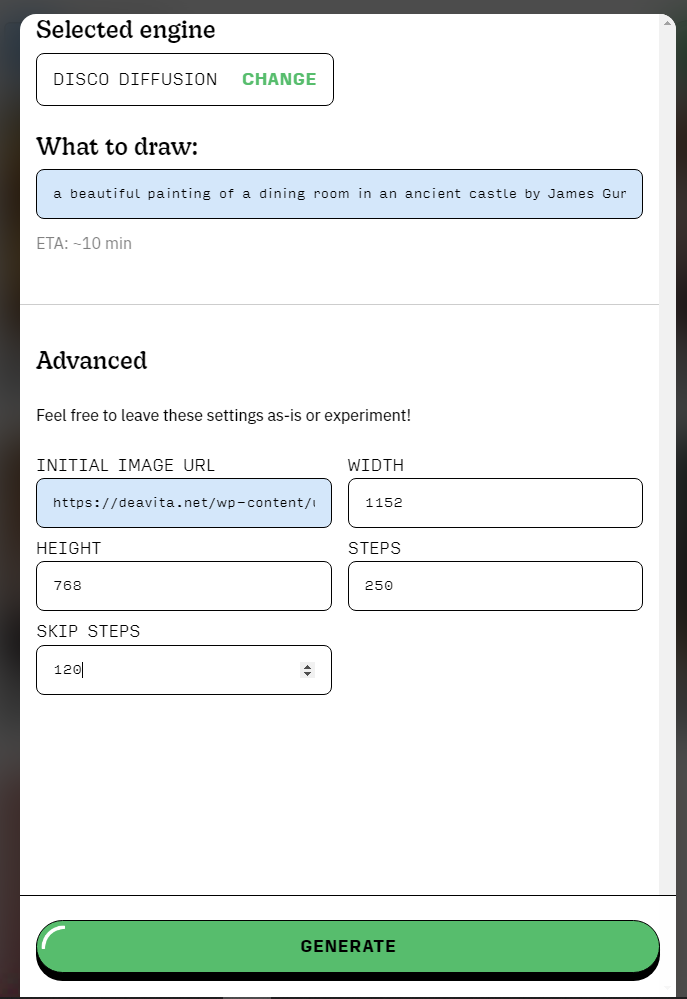
When I put in “skip steps” of 160 (that is, skip the first 160/250 of the steps in generation— the ratio is what matters more than the absolute values) the result looks like this:
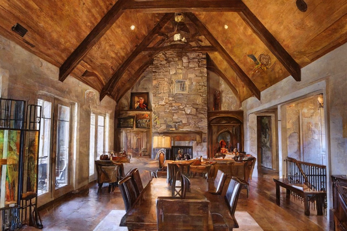
It looks more like a painting, and the feel is a little more medieval, but it is far too much like the original photo. The windows on the left, for example, seem very modern. If I put in “skip steps” of 80 instead, this is what I get:
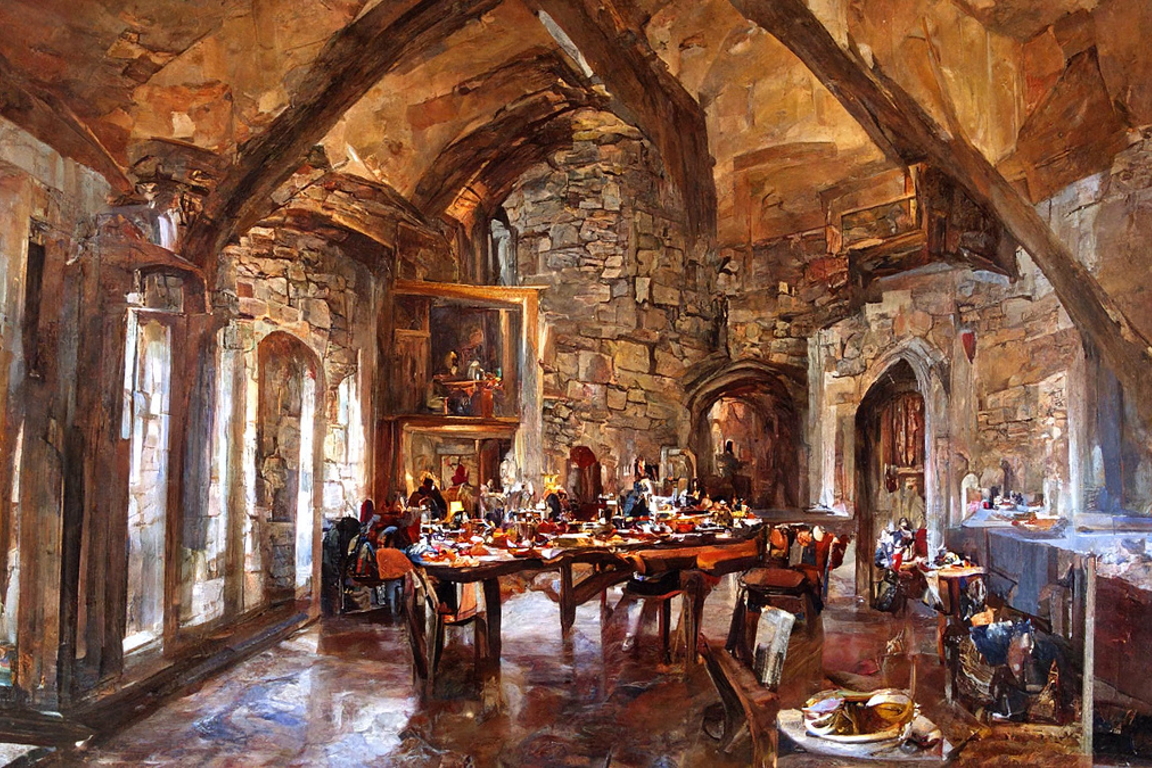
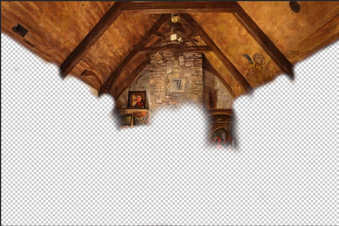
That’s more castle-like than the last try, and more consistent than the one without an initial image. So at this point I’m going to take the 80/250 and 160/250 images I’ve generated into another program. I’ll layer the 80/250 image over the 160/250 image, and erase through the parts I don’t like, so that you see the roof from the 160/250 image and the rest from the 80/250 image. Here is the top layer, so you can see what I’ve kept and what I erased to show through the other layer:
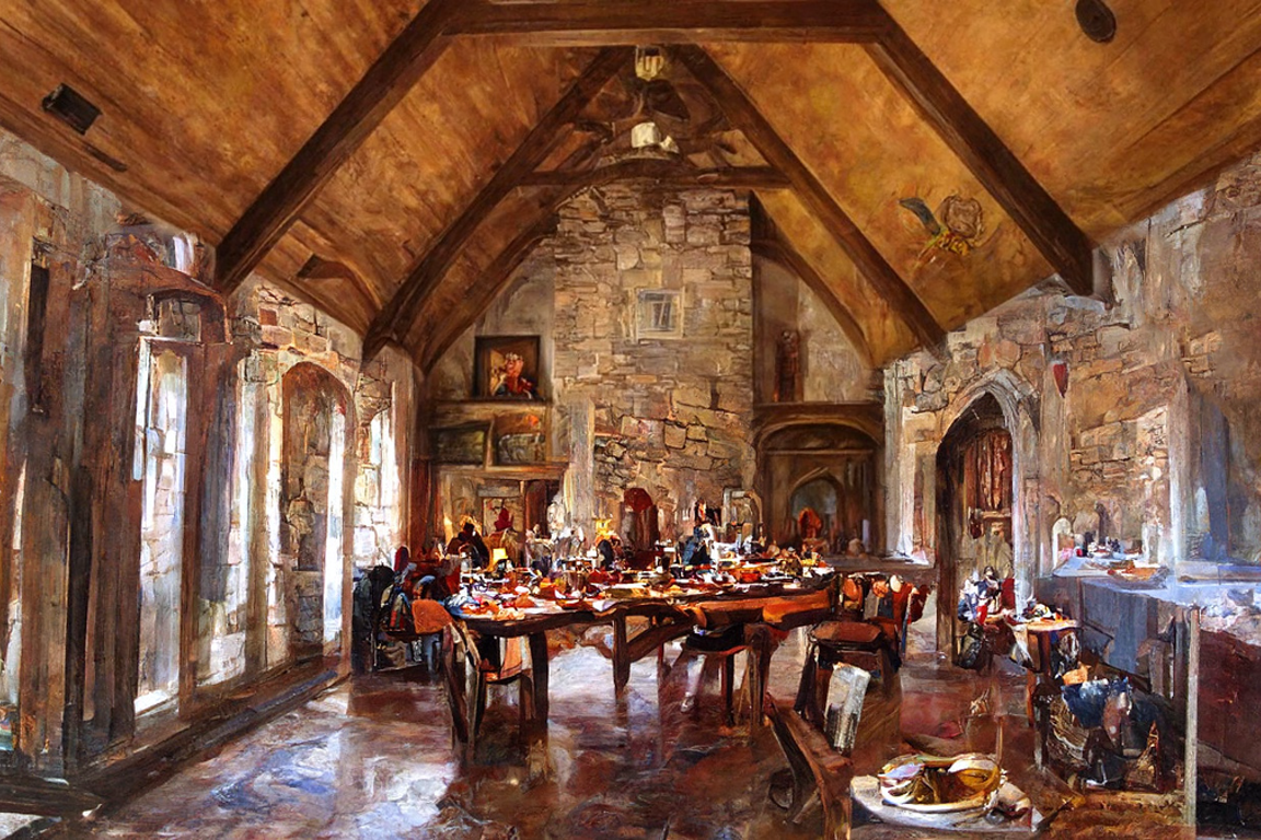
I think I’ll stick with this image. I could touch it up a little more, but it would require some more artistic skill and more powerful tools. I especially like to use the “healing brush” tool in Photoshop for images like these. Those weird blobs on the ceiling and some of the more problematic window tops could be cleaned right up.
I hope this has given you some ideas for how to use AI Art as a tool to create precisely what you’re imagining. The best results will come with a bit of planning, experimentation, and iteration.
Douglas Summers Stay
Voyage Game Developer